The idea of the responsive layout is to allow viewing the website on devices with small screens. To make this possible the browser should be able to change the layout depending on the available screen width of the device. What and how should be done is described using the CSS3 media rules…
In fact, there already were some attempts to make the Redmine layout responsive… The best known one was made by Xander Dumaine, but his theme is not maintained and currently is available generally as the article describing how to make a responsive theme for Redmine (nevertheless, I used his article a little to make Red-Andy responsive). There is also the RedmineCRM theme of Kirill Bezrukov, which is described as “responsive”, but I have not found any proof of this (neither a screenshot, nor any code making it really responsive – looks like Kirill meant something else, when described the theme this way)… Considering this Red-Andy 1.00 seems to be the first (and only) responsive theme for Redmine!
It should be realized, that the Redmine layout is not small screen ready! So, generally, making its theme responsive is a complicated task and not everything is possible to fix. In other words, to achieve the responsiveness I was forced to use hacks and, as far as I was trying to use as less hacks as possible, some issues are still going to be experienced on mobile devices. However, Red-Andy achieves its main goal – it does makes it possible to view the vast majority of Redmine pages on mobile devices! This is enough for me. And I hope that you will find it useful too.
The discussed responsiveness does not affect the layout of Redmine pages on normal (big) screens!
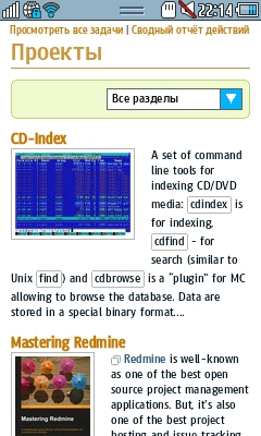
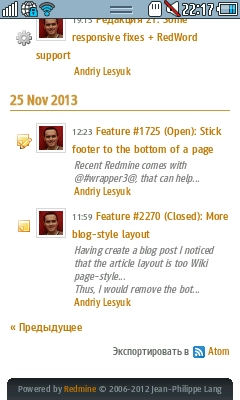
So let’s now check some shots of screens on a mobile device:
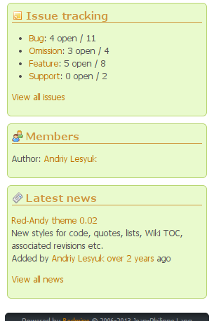
The project overview page
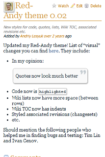
The news page
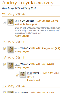
The activity page
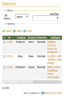
The issue list
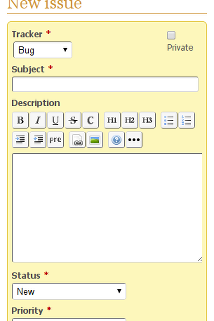
The new issue page
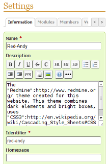
The project settings page
As you can see changes, that are made to the Redmine layout, when it’s rendered on small screens, include:
- The project menu has arrows, which allow moving the menu items.
Same arrows are used for project settings tabs etc. - The sidebar is shrunk by default.
The grey arrow can be used to open it. - There are no left and right columns.
All boxes are shown in a single column. - The issue list table is still wide, but can be scrolled horizontally.
- Form labels are rendered above form elements.