The idea of the responsive layout is to allow viewing the website on devices with small screens. To make this possible the browser should be able to change the layout depending on the available screen width of the device. What and how should be done is described using the CSS3 media rules…
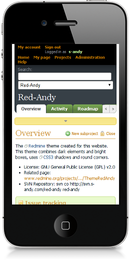
In fact, there already were some attempts to make the Redmine layout responsive… The best known one was made by Xander Dumaine, but his theme is not maintained and currently is available generally as the article describing how to make a responsive theme for Redmine (nevertheless, I used his article a little to make Red-Andy responsive). There is also the RedmineCRM theme of Kirill Bezrukov, which is described as “responsive”, but I have not found any proof of this (neither a screenshot, nor any code making it really responsive – looks like Kirill meant something else, when described the theme this way)… Considering this Red-Andy 1.00 seems to be the first (and only) responsive theme for Redmine!