 My site is going mobile
 Several last months I worked on making my website look acceptably on smartphones…
From time to time being away from my computer I was trying to check issues, reread news, Wiki pages and the similar on my old Samsung bada-powered smartphone (well, I use the cell phone just for calls, mostly). And it was an awful experience! This way I became curious about making my website responsive (but, certainly, first I needed to learn, what does “responsive” mean)…
Currently, I have the blog (this one), which runs on WordPress and still is much based on Redmine… Thus, my blog uses the Redword theme, which in turn uses the Red-Andy theme for Redmine. So, certainly I decided to make my Red-Andy theme responsive. But it appeared to be not easy…
The problem around Redmine themes is that they are pure CSS customizations. Having figured out, that for a responsive website I needed the viewport META, I gave up (as META tags can’t be added using just CSS). But later, thanks to Xander Dumaine, I found, that the viewport META tag can be added using JavaScript and Redmine themes are able to include custom JavaScript code. So I got back to experimenting with my site, its Red-Andy theme and my mobile phone. These experiments (i.e., improvements, customizations and so on), in fact, last till today and will, probably, last some more time… Anyway, the site now works fine on mobile devices – is responsive and usable (but some more improvements are to be or can be done)! So this article is a news/announcement for this! In other words, you can access this site from your smartphones now!
Also, this article is an announcement of the upcoming Red-Andy theme release, which will include responsiveness and, therefore, mobile support. This way the Red-Andy theme will become, as far as I know, the first and only responsive Redmine theme. Certainly, there were other tries like the Mobile theme from Xander Dumaine, but they were incomplete and/or unmaintained (at least accordingly to the information I have – I personally have not tried the Xander’s theme).
And, finally, here are some screenshots of my website taken on my old Samsung bada smartphone:

The landing page (WordPress)

An article (WordPress)
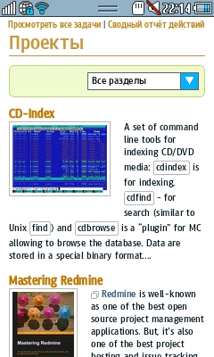
The project list (Redmine)
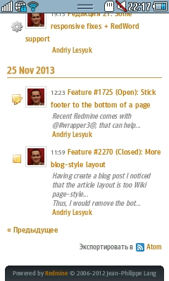
The activity list (Redmine)

A project page (Redmine)
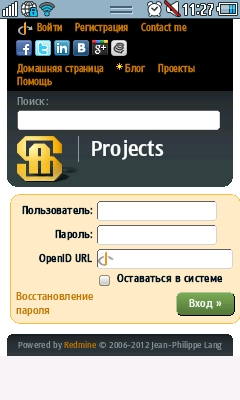
The login page (Redmine)
Comments
Also available in: Atom
Add a comment